|
|
"A comprehensive, collaborative elections resource."
|
BNP unveils new logo with 'better aesthetic image'
|
|---|
| Parent(s) |
Party
|
| Contributor | Ralphie |
| Last Edited | Ralphie May 14, 2011 12:39am |
| Logged |
0
|
| Category | Announcement |
| Media | Newspaper - Guardian |
| News Date | Thursday, May 12, 2011 06:00:00 AM UTC0:0 |
| Description | 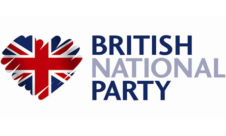
The motif is supposed to be a patriotic heart, but its sketchy lines could equally resemble the outlines of a coiled snake on a slope or a partially rubbed windscreen.
The British National party has circulated its latest logo around the media in a determined attempt to present a new image.
Any stylistic similarity with the rough shading displayed in the Conservatives' green and blue tree symbol is entirely "unintentional", a BNP spokesman insisted. |
| Share |
|
|
2¢
|
|
| Article | Read Full Article |
|
| Date |
Category |
Headline |
Article |
Contributor |
|
|